Explore
The Explore tab is your SQL workspace for querying and exploring data. Think of it as a built-in query editor with visualization capabilities — similar to tools like Mode or Looker's SQL Runner.
The Query Editor
Writing Queries
The main area of the Explore tab is a SQL editor where you can write and run queries against your connected databases. The editor includes:
- Syntax highlighting for SQL
- Auto-formatting to clean up your SQL
- Query execution via the Run button or keyboard shortcut
Type your SQL, hit Run, and results appear in a table below the editor.
Saved Queries
On the left side of the query panel, you'll see a list of Saved Queries. These are queries that have been saved for reuse. You can:
- Search through saved queries by name
- Click a saved query to load it into the editor
- Save a new query by giving it a name after writing it
- Share saved queries with other workspace users via direct links
Saved queries support parameters — placeholder values that can be filled in via a form when the query is run. This is useful for creating reusable reports (e.g., "Show me results for month = ____").
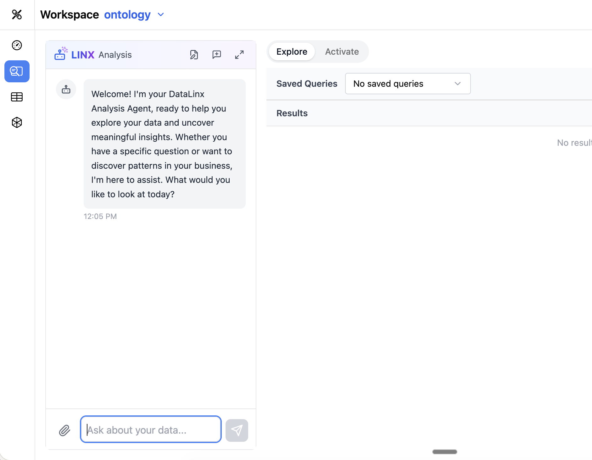
Results Table
After running a query, results appear in a data table with:
- Column headers with data types
- Sorting — click any column header to sort
- Pagination — navigate through large result sets
- Row count — see how many rows were returned
Visualizations
One of the most powerful features of the Explore tab is the ability to turn query results into visualizations. After running a query:
- Click the Visualization option above the results
- Choose a chart type:
- Bar chart — compare values across categories
- Line chart — show trends over time
- Pie chart — show proportions
- Scatter plot — show relationships between two measures
- Heatmap — show intensity across two dimensions
- Histogram — show distribution of values
- Box plot — show statistical distribution
- Sankey diagram — show flows between categories
- Configure which columns map to which axes
- The visualization renders interactively (powered by Plotly)
Visualizations can be saved as part of a dashboard tile.
Using the Analysis Agent
The Analysis Agent (in the left panel) can help you with queries:
- "Write a query that shows the top 10 customers by revenue"
- "Add a filter for the last 30 days"
- "Turn this into a line chart"
- "Save this query as 'Monthly Revenue Trend'"
The agent understands your schema and can generate SQL tailored to your actual data.
Tips
- Use the Explore tab for ad-hoc exploration and report building
- Save queries you'll reuse — they become accessible to your whole team
- Combine saved queries with dashboard tiles for self-service reporting
- The agent is especially helpful if you're not comfortable writing SQL from scratch